golden rectangle
What makes the “golden rectangle” so aesthetically pleasing that it (kind of) appears in everyone’s favorite 16th-century painting, the Parthenon, and international paper sizes? It’s the ratio of the sides, of course, which are equal to the golden ratio: approximately 1.618. Make sense now? Good.
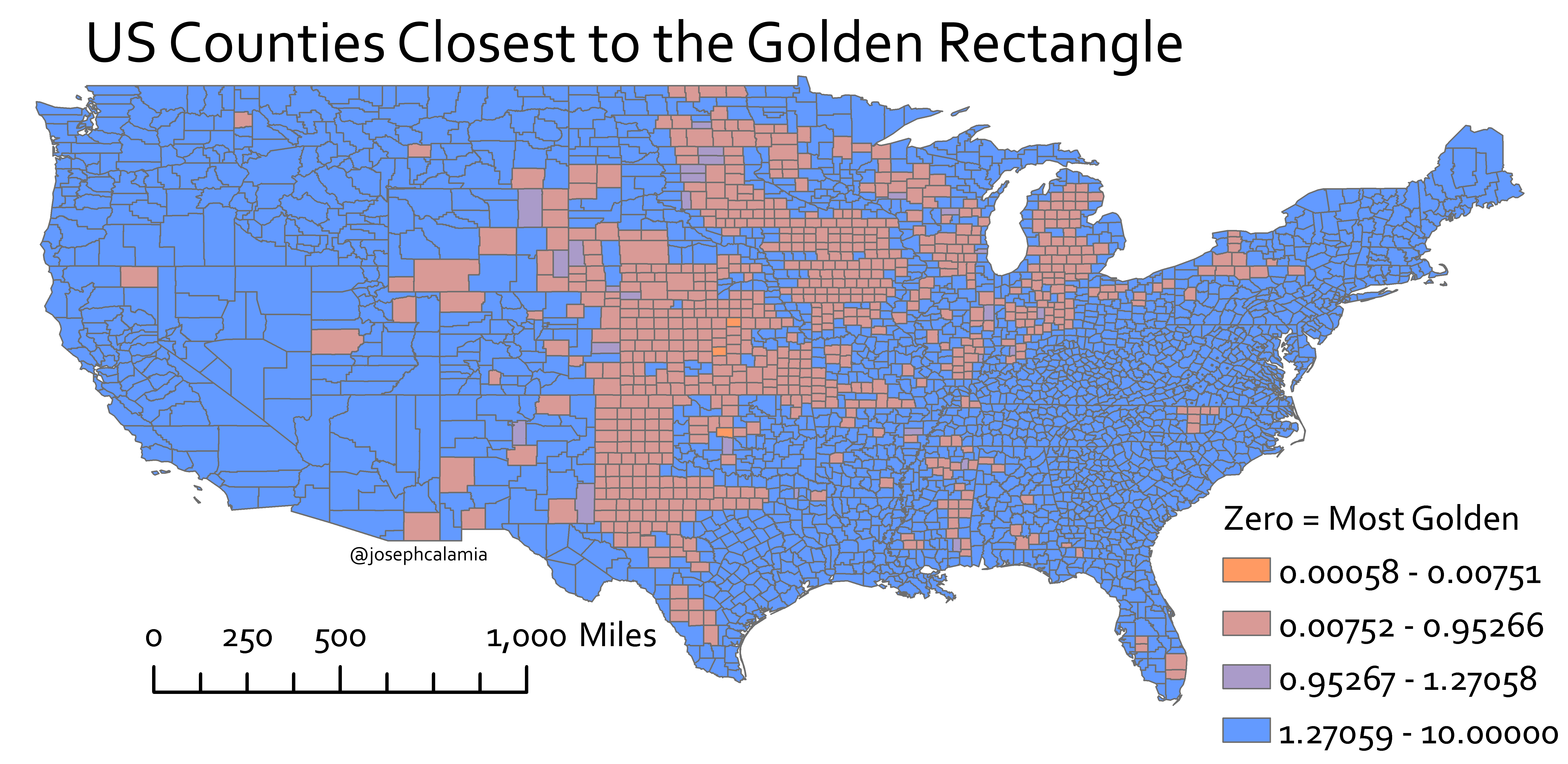
The next logical question: what geographical boundaries most closely match the aspect ratio of this special rectangle? I wrote a tool for the mapping software ArcGIS to answer this question. The program starts by calculating the actual area of every territory in the map. It then determines the maximum horizontal and vertical extents (width and height) of each of those territories, and multiplies these two values together.
Let’s call the call the product of these two extents the “square area” (or the squarea?). Of course, if the shape is an honest-to-goodness rectangle, the horizontal extent (width) multiplied by the vertical extent (height) would be exactly the total area. The program then divides the actual area by this square area to determine a value we will call the “squareness.” An actual rectangle, again, would have a squareness value of 1 (and the less rectangular, the smaller the squareness value).
As an example, here are the most rectangular US counties, according to my program:
- Chase, Nebraska (squareness: .99745)
- Jewell, Kansas (squareness: .99721)
- Osborne, Kansas (squareness: .99710)
- Hanson, South Dakota (squareness: .99692)
- Dimmit, Texas (squareness: .99682)
I use this squareness value as a threshold for which territories we should evaluate for the title of most golden. For a map of US counties, I exclude all counties with a squareness value below .90. The program then evaluates these remaining territories, divides the longest side by the shortest side, and compares to the golden ratio of 1.618.
The map above is the result of running this program on a map of US counties. The colors indicate closeness to golden ratio, with blue being the least rectangular (and not contenders for the golden ratio crown) and the burnt sienna being those rectangular counties with extents closest to the golden ratio. The legend shows the difference between the aspect ratio and the golden ratio.
From this rough tool, the top five US counties. according to golden-rectangular-ness:
- Republic, Kansas (squareness: .99231, aspect ratio: 1.61746)
- Canadian, Oklahoma (squareness: .91603, aspect ratio: 1.61418)
- Ellsworth, Kansas (squareness: .98475, aspect ratio: 1.61052)
- Logan, Colorado (squareness: .96654, aspect ratio: 1.62572)
- Mitchell, Kansas (squareness: .99441, aspect ratio: 1.62825)
Given all the golden counties in Kansas, it’s tempting to say that this is the most golden state in the union. Reevaluating on a state scale though, Kansas comes in the middle of the rectangular state pack.
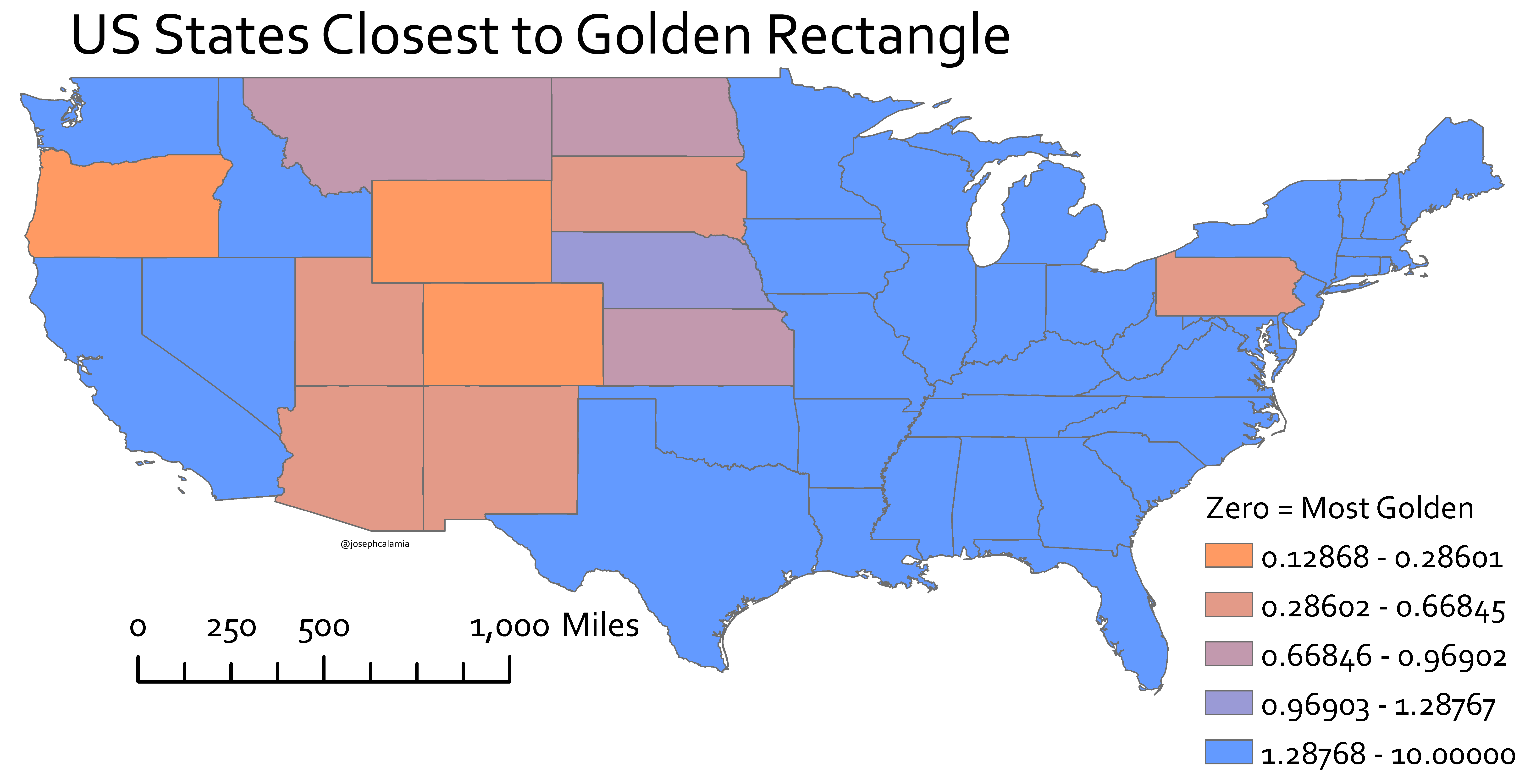
States closest to having an aspect ratio closest to golden ratio. (Created by J. Calamia)
(Note: For this evaluation I allowed states that were a bit less rectangular, setting the squareness threshold value at .80)
Here Wyoming is the winner and Colorado a close second.
- Wyoming (squareness: .99645, aspect ratio: 1.74672)
- Colorado (squareness: .99525, aspect ratio: 1.74838)
- Oregon (squareness: .82022, aspect ratio: 1.90405)
- New Mexico (squareness: .90345, aspect ratio: 1.0703)
- South Dakota (squareness: .85815, aspect ratio: 2.20592)
So the gold (ahem) medals go to Republic, Kansas and Wyoming.
